This post is the second in a series on linear discriminant analysis (LDA) for classification. In the first post, I introduced much of the theory behind linear discriminant analysis. In this post, I’ll explore the method using scikit-learn. I’ll also discuss classification metrics such as precision and recall, and compare LDA to logistic regression via ROC curves.
Several other Python libraries do support LDA. However, scikit-learn in by far the best option. The libraries mlpy and MDP have not been updated since 2012 and 2016, respectively. The library PyMVPA has been updated more recently, but has only 66 downloads from PyPI over the past 30 days, compared to scikit-learn’s 7.3 million downloads.
Titanic dataset
For this working example, I’ll be using the same slimmed down Titanic dataset used in a previous logistic regression post.
>>> titanic
        sex   age     fare  ticket_class  survived
0      male  22.0   7.2500             3         0
1    female  38.0  71.2833             1         1
2    female  26.0   7.9250             3         1
3    female  35.0  53.1000             1         1
4      male  35.0   8.0500             3         0
..      ...   ...      ...           ...       ...
709  female  39.0  29.1250             3         0
710    male  27.0  13.0000             2         0
711  female  19.0  30.0000             1         1
712    male  26.0  30.0000             1         1
713    male  32.0   7.7500             3         0
[714 rows x 5 columns]
Linear discriminant analysis with one predictor
To begin, let’s explore linear discriminant analysis with just one predictor. We’ll classify whether a passenger survived the Titanic sinking or not based on the fare that passenger paid. We might expect passengers who paid a higher fare would be more likely to survive.
import pandas as pd
from sklearn.discriminant_analysis import LinearDiscriminantAnalysis

# Assigning X and y
X = titanic[["fare"]]
y = titanic["survived"]

# Initializing the LDA estimator
lda = LinearDiscriminantAnalysis()

# Performing LDA
lda.fit(X, y)
We can view the predicted values and the correct classification rate via the predict() and score() methods.
>>> lda.predict(X)
array([0, 0, 0, 0, 0, 0, 0, 0, 0, 0, 0, 0, 0, 0, 0, 0, 0, 0, 0, 0, 0, 0,
       0, 1, 0, 0, 1, 0, 0, 0, 0, 0, 0, 0, 0, 0, 0, 0, 1, 0, 0, 0, 0, 0,
       ...
       ])

>>> lda.score(X, y)
0.6526610644257703
Our current model correctly predicts whether a passenger survives or not about 65% of the time. Below we’ll investigate if this model is performing well or not.
Linear discriminant analysis with multiple predictors
Because linear discriminant analysis assumes that the random variable $X = (X_1, X_2, \ldots, X_p)$ is drawn from a multivariate Gaussian distribution, it does not tend to perform well with encoded categorical predictors. Similarly, because of this assumption, LDA is also not guaranteed to find an optimal solution for non-Gaussian distributed predictor variables. It should be noted that LDA is somewhat robust to such predictor variables - and may even perform fairly well on classification tasks - but it will likely not find LDA decision boundaries near the optimal Bayes decision boundaries.
In the below example, I’ll use both the quantitative age and fare variables to build an LDA classifier for whether a passenger survived or not. Before creating the classifier, let’s visualize the distribution of the two predictors to access their normality.
import matplotlib.pyplot as plt
import seaborn as sns

# Creating matplotlib subplots
fig, axes = plt.subplots(1, 2)

# Plotting side-by-side histograms
# kde=True draws a kernel density estimation of the probability density function
sns.histplot(titanic["age"], kde=True, color="skyblue", ax=axes[0])
sns.histplot(titanic["fare"], kde=True, color="olive", ax=axes[1])
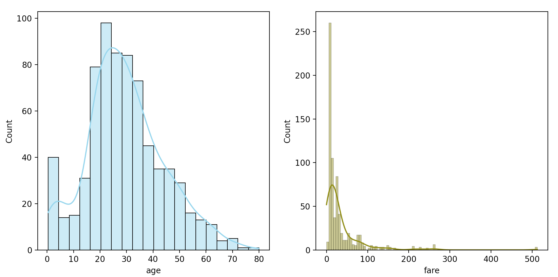
The two distributions are clearly skewed right, with fare having a stronger skew than age. For the sake of this working example, we’ll just keep this in mind as we continue.
Next, we’ll perform our linear discriminant analysis.
X = titanic[["age", "fare"]]

# Initializing new LDA estimator and fitting
lda = LinearDiscriminantAnalysis()
lda.fit(X, y)

# Getting correct classification rate
lda.score(X, y)
The correct classification rate for this model, obtained via the score() method, is approximately 0.647. Interesting, including age seemed to cause our model to perform worse.
It should be noted, that the correct classification rate here is the rate on the training data. We would expect our model to perform better on training data than test data, so the score value here is likely inflated.
Null error rate
Worth discussing before we continue is the null error rate determined by the null classifier. The null classifier is simply a classifier that always classifies an observation to the majority class. For our use case, the null classifier would predict that every passenger died on the Titanic, and it would be correct for 59% of our training data.
sum(titanic["survived"] == 0) / len(titanic) # 0.594
As such, or best LDA classification rate of 65.3% above is not much better than the null error rate.
Classification metrics
Next, we’ll explore some common metrics to access the performance of our binary classifier. In particular, we’ll explore accuracy, precision, recall, and the $F_1$ score.
Confusion matrices
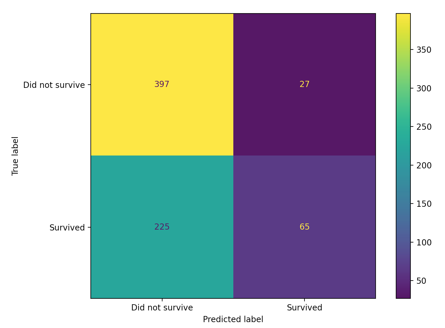
First however, let’s create a confusion matrix of our observed and predicted values. A confusion matrix is a special type of contingency table that shows the number of true positives, false positives, false negatives, and true negatives from a binary classification task. We can use scikit-learn’s confusion_matrix() function for this.
>>> from sklearn.metrics import confusion_matrix

# Assigning predicted y values
>>> y_pred = lda.predict(X)

# Creating confusion matrix
>>> confusion_matrix(y_true=y, y_pred=y_pred)
array([[397,  27],     # First row:  true negatives, false positives
       [225,  65]])    # Second row: false negatives, true positives

# Getting individual values
tn, fp, fn, tp = confusion_matrix(y, y_hat).ravel()
We can also plot this confusion matrix for a visual representation.
from sklearn.metrics import plot_confusion_matrix

plot_confusion_matrix(estimator=lda,
                      X=X,
                      y_true=y,
                      display_labels=["Did not survive", "Survived"])
Accuracy
Let’s start our decision of some common classification metrics with accuracy. Accuracy is defined as
\[\begin{aligned} \frac{\text{number of true negatives} + \text{number of true postives}}{\text{number of true negatives} + \text{number of true positives} + \text{number of false negatives} + \text{number of false positives}}. \end{aligned}\]Accuracy has a pretty simple to understand meaning, and is simply the proportion of how many observations our model correctly classified. In our above confusion matrix, $\text{accuracy} = \frac{397 + 65}{397 + 65 + 27 + 225} = 0.647$.
Precision
Next, we’ll explore precision. Precision is defined as
\[\begin{aligned} \frac{\text{number of true positives}}{\text{number of true positives} + \text{number of false positives}} . \end{aligned}\]If we look at our above confusion matrix, $\text{precision} = \frac{65}{65 + 27} = 0.707$. Intuitively, precision is representing the proportion of all our predicted positive values that are actually positive. When comparing different classification models, precision is a good measure when we want to avoid false positives.
For example, when detecting spam emails, a model with high precision is likely preferred. In the case of spam email, the email user would much rather get the occasional spam email (a false negative) than miss an important email that wasn’t spam (a false positive).
Recall
Next, let’s discuss recall. Recall is defined as
\[\begin{aligned} \frac{\text{number of true positives}}{\text{number of true positives} + \text{number of false negatives}}. \end{aligned}\]If we look at our above confusion matrix, $\text{recall} = \frac{65}{65 + 225} = 0.224$. Intuitively, recall is representing how well a model is classifying positive observations as actually positive. When comparing different classification models, recall is a good measure when we want to avoid false negatives.
In my current work in anomaly detection, recall is a metric of particular interest. When classifying events as anomalous or not, I would much rather classify a non-anomalous event as anomalous (a false positive), than misclassify an actual anomaly as non-anomalous (a false negative). Said another way, out of all the actual anomalies out there, I want to make sure I detect as many as I can, even at the expense of including some false positives.
In the medical setting, recall is more commonly referred to as sensitivity. A related term in the medical literature is specificity, which is equivalent to the true negative rate. Occasionally, specificity is also referred to as recall of the negative class.
$F_1$ score
Lastly, let’s explore the $F_1$ score. The $F_1$ score is the harmonic mean of precision and recall, and is defined as
\[\begin{aligned} 2 \cdot \frac{(\text{precision} \cdot \text{recall})}{\text{precision} + \text{recall}}. \end{aligned}\]When comparing models, the $F_1$ score is useful when we want to strike a balance between precision and recall. That is, when we want to avoid both false positives (as in spam email classification) and false negatives (as in anomaly detection).
scikit-learn’s classification_report
To calculate the above metrics, we can use scikit-learn’s classification_report function.
>>> from sklearn.metrics import classification_report

>>> print(classification_report(y_true=y,
                                y_pred=y_pred,
                                target_names=["Did not survive", "Survived"]))

                 precision    recall  f1-score   support
Did not survive       0.64      0.94      0.76       424
       Survived       0.71      0.22      0.34       290

       accuracy                           0.65       714
      macro avg       0.67      0.58      0.55       714
   weighted avg       0.67      0.65      0.59       714
Note that our manually calculated values of precision, recall, and the $F_1$ score align with the Survived row above. For completeness, support simply refers to the number of observations in each class. For our working example, that is number of observations that did not survive (424) or that did survive (290) present in our training data.
ROC curves
As a final topic for discussion, let’s compare our two-predictor LDA model above with the corresponding logistic regression model. First, let’s train our logistic regression model.
from sklearn.linear_model import LogisticRegression

# Setting penalty="none" to disable regularization
log_reg = LogisticRegression(penalty="none")
log_reg.fit(X, y)

log_reg.score(X, y)  # 0.657
Our correct classification rate of 0.657 from the logistic regression model is slightly better than that of our LDA model.
As a more thorough comparison of these two models, let’s draw each’s ROC curve and calculate the area under the curve, or AUC. A ROC curve, named such for historical reasons, is drawn by adjusting the probability threshold needed to classify an observation to the positive class.
In the standard logistic regression setting, an observation is classified to the class for which the predicted probability is greatest. In the standard linear discriminant analysis setting, an observation is classified to the class for which the posterior probability $Pr(Y=k \vert X=x)$ is greatest. For binary classification, both of these methods are equivalent to assigning an observation to a class if the predicted probability (for logistic regression), or the posterior probability (for LDA), is greater than 0.5.
However, this threshold of 0.5 can be adjusted. Perhaps, we want to assign any observation with a predicted probability greater than 0.25 of belonging to the positive class to that class. Or, we may want to assign any observation with a posterior probability greater than 0.10 of belonging to the positive class to that class.
Changing these thresholds will also change the accuracy, precision, recall and $F_1$ score of our model, since we are changing the number of true positives, false positives, true negatives and false negatives.
Reasoning for why we may want to change this threshold often rests on domain knowledge. For example, in my current work in anomaly detection, I may be interested in classifying some observations as anomalous in a greedy manner. That is, if the observation has a somewhat high probability of being an anomaly (say 30% or 40%), it may be beneficial to classify the observation as an anomaly. This is particularly true of highly impactful types of anomalies we are especially interested in detecting.
In contrast, for less impactful anomalies, it may be beneficial to classify an observation as an anomaly only if the observation has a fairly high probability of being an anomaly (say 70% or 80%). In both of these instances, domain knowledge of the types of anomalies I am interested in detecting is crucial.
With that being said however, a useful manner of comparing different classifiers is the ROC curve, and the associated AUC metric. A ROC curve is drawn for a classifier by changing the threshold value needed to classify an observation as a positive observation, and then plotting the true positive versus false positive rates for each threshold value.
An ideal ROC curve hugs the top-left corner of the plot, and has a large area under the curve value. An AUC of 1 indicates a perfect classifier for all threshold values, and an AUC below 0.5 indicates the classifer is worse than random guessing. For comparison purposes, a higher AUC value among models indicates a better classifier for that particular dataset.
Below, we’ll draw two ROC curves for our logistic regression and LDA models.
from sklearn.metrics import plot_roc_curve

roc_lda = plot_roc_curve(estimator=lda, X=X, y=y)
roc_log_reg = plot_roc_curve(estimator=log_reg, X=X, y=y, ax=roc_lda.ax_)
plt.title("ROC Curve Comparison")
plt.show()
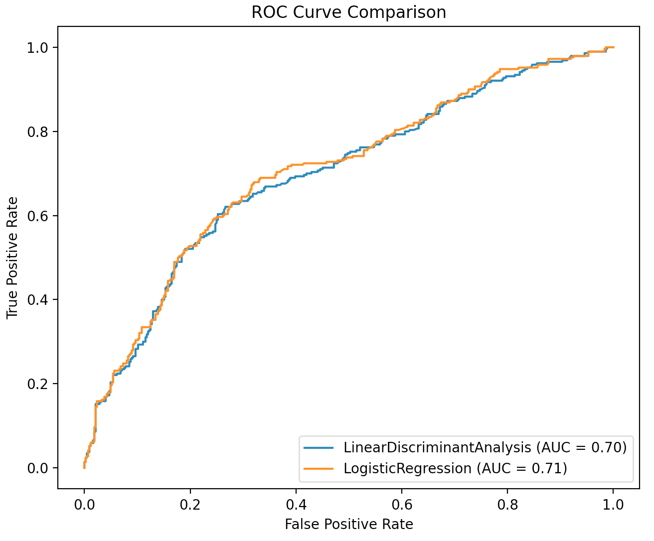
From the above plot, we see the ROC curves are almost identical. The logistic regression model has a slightly high AUC value, but this different is nearly negligible.