Principal components analysis (PCA) is a technique that computes the principal components of a dataset and then subsequently uses these components in understanding the data. PCA is an unsupervised approach. In a future post, I’ll explore principal components regression, a related supervised technique that makes uses of the principal components when fitting a linear regression model. PCA is commonly used during exploratory data analysis to understand and project multidimensional data into a low-dimensional space, and as a preprocessing step for regression, classification, and clustering techniques. When using PCA as a preprocessing step for other techniques, we often get less noisy results, as it is often the case that the signal (in contrast to the noise) in a dataset is concentrated in its first few principal components.
In the below post, I’ll expand on this and provide an overview of PCA that includes an explanation of principal components, as well as a geometric interpretation of the principal components.
The structure of this post was influenced by the tenth chapter of An Introduction to Statistical Learning: with Applications in R by Gareth James, Daniela Witten, Trevor Hastie, and Robert Tibshirani.
Principal components
When attempting to understand $n$ observations measured over $p$ features $X_1, X_2, \ldots, X_p$, $p$ is often quite large. When this is the case, it is not feasible to plot our data entirely via two or three-dimensional scatter plots and accurately understand the larger dataset. By only viewing two or three features at a time, we simply lose too much information, especially when $p$ is greater than 10 or 20.
To mitigate this, we can find a low-dimensional representation of our data that captures as much of the information as possible. For example, if we are able to find a two or three-dimensional representation of a dataset that contains 20 predictor features - and this low-dimensional representation accurately represents these features - we can then project our data into this low-dimensional space to better visualize and understand it.
PCA allows us to do just this by finding a low-dimensional representation of a dataset that contains as much of the variation as possible. The idea behind PCA is that each of the $n$ observations lives in $p$-dimensional space, but not all of these dimensions are equally interesting. PCA attempts to find a small number of dimensions that are as interesting as possible, where interesting is measured by the amount that the observations vary along each dimension. These small number of dimensions that contain as much variation as possible are referred to as principal components. Each of the principal components found by PCA is a linear combination of the $p$ features.
The first principal component of a set of features $X_1, X_2, \ldots, X_p$ is the normalized linear combination of the features
\[\begin{aligned} Z_1 = \phi_{11}X_1 + \phi_{21}X_2 + \ldots + \phi_{p1}X_0 \end{aligned}\]that has the largest variance. Here, normalized means that $\sum_{j=1}^{p} \phi_{j1}^2 = 1$. The elements $\phi_{11}, \phi_{21}, \ldots, \phi{p1}$ are referred to as the loadings of the first principal component. Together, the loadings make up the principal component loading vector $\phi_1 = (\phi_{11} \phi_{21} \ldots \phi_{p1})^T$. Note, if we did not constrain the loadings such that their sum of squares must equal one, these elements could be arbitrarily large in absolute value and would result in arbitrarily large variance.
Specifically, the first principal component loading vector solves the optimization problem
\[\begin{aligned} \stackrel{\text{maximize}}{\phi_{11}, \ldots, \phi_{p1}} \bigg\{\frac{1}{n}\sum_{i=1}^{n}\ \bigg( \sum_{j=1}^{p}\phi_{j1}x_{ij} \bigg)^2\bigg\} \text{ subject to } \sum_{j=1}^{p}{\phi_{j1}^2 = 1}, \end{aligned}\]which is solvable via eigen decomposition. The above objective function is equivalent to maximizing the sample variance of the $n$ values $z_{11}, z_{21}, \ldots, z_{n1}$. We refer to the values $z_{11}, z_{21}, \ldots, z_{n1}$ as the scores of the first principal component.
There is a nice geometric interpretation of the first principal component as well. The loading vector $\pi_1$ with elements $\phi_{11}, \phi_{21}, \ldots, \phi_{p1}$ defines a direction in feature space along which the data vary the most. Projecting the $n$ data points $x_1, \ldots, x_n$ onto this direction gives us the principal component scores $z_{11}, \ldots, z_{n1}$ themselves.
After calculating the first principal component $Z_1$ of the features, we can find the second principal component $Z_2$. The second principal component is the linear combination of $X_1, \ldots, X_p$ that has maximal variance out of all linear combinations that are uncorrelated with $Z_1$. Constraining $Z_2$ to be uncorrelated with $Z_1$ is equivalent to constraining the second principal component loading vector $\phi_2$ with elements $\phi_{12}, \phi_{22}, \ldots, \phi_{p2}$ to be orthogonal with the direction $\phi_1$. We calculate additional principal components in the same way as above, with the constraint that they are uncorrelated with earlier principal components.
After computing the principal components, we can plot them against each other to produce low-dimensional views of the data. Geometrically, this is equivalent to projecting the original data down onto the subspace spanned by $\phi_1$, $\phi_2$, and $\phi_3$ (in the event where we calculated the first three principal components), and plotting the projected points.
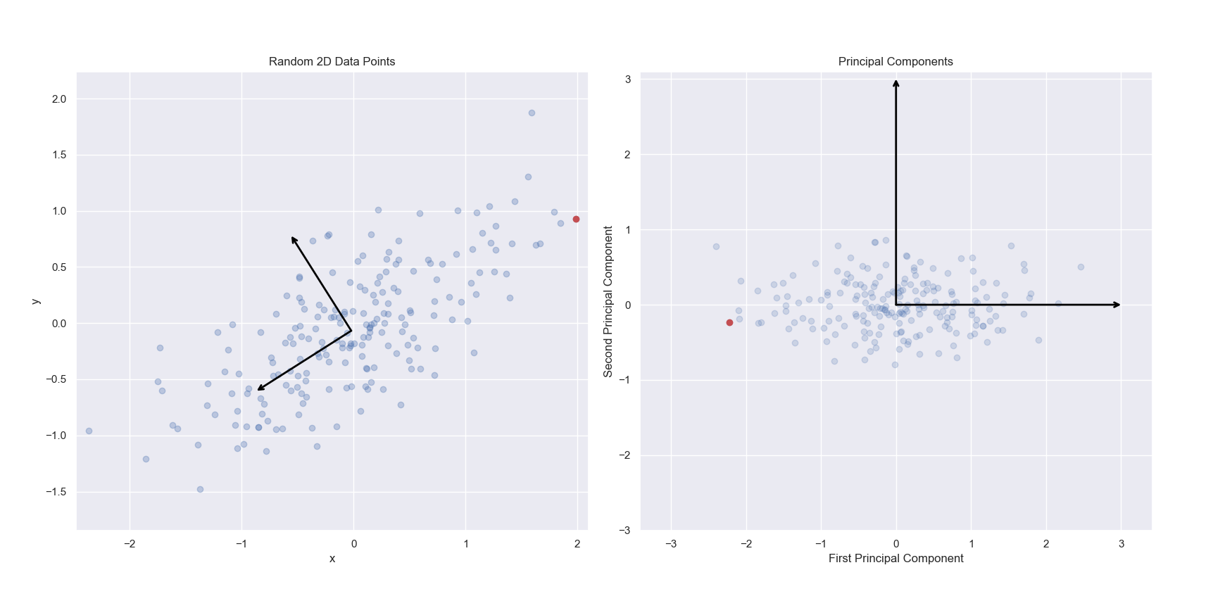
In the below left image, we see a scatter plot of a randomly generated two-dimensional dataset. The first and second principal components of this dataset have been indicated via arrows. In the right image, we see the same data projected onto the first and second principal components. Specifically, we are seeing the scores for each observation. To clarify this, I have marked the same observation as red in the left and right panels. Notice in the left panel, the red point contains the most positive x value. The same point shown on the right panel has been projected into the new two-dimensional space of the principal components. While it still has an extreme value, the projected value of the point just to the left of it onto the first principal component is more extreme. This point corresponds to the point with the most positive y value in the left panel.
Note, that the singular value decomposition used to solve for principal components are unique up to a change in sign. Thus, PCA is not guaranteed to always return the same signs on the same input features. scikit-learn’s implementation of PCA does not change sign on repeated iterations on the same input dataset, but it does not guarantee which values will be positive or negative. This explains why the red point is on the right in the left panel, and the left in the right panel. For more information, see this Stack Overflow thread.
The below code snippet was modified from Jake VanderPlas’ Python Data Science Handbook.
import matplotlib.pyplot as plt
import numpy as np
import pandas as pd
import seaborn as sns

# Setting plot theme
sns.set_theme()

# Defining function to draw principal component vectors
def draw_vector(v0, v1, ax=None):
    ax = ax or plt.gca()
    arrowprops=dict(arrowstyle="->",
                    linewidth=2,
                    shrinkA=0,
                    shrinkB=0,
                    color="black")
    ax.annotate("", v1, v0, arrowprops=arrowprops)

# Generating data
rng = np.random.RandomState(123)
X = np.dot(rng.rand(2, 2), rng.randn(2, 200)).T
pca = PCA(n_components=2)
pca.fit(X)

fig, ax = plt.subplots(1, 2, figsize=(16, 6))
fig.subplots_adjust(left=0.0625, right=0.95, wspace=0.1)

# Plotting data and principal component vectors
ax[0].scatter(X[:, 0], X[:, 1], alpha=0.3)
for length, vector in zip(pca.explained_variance_, pca.components_):
    draw_vector(pca.mean_, pca.mean_ + vector, ax=ax[0])
ax[0].axis("equal")
ax[0].set(xlabel="x",
          ylabel="y",
          title="Random 2D Data Points")

# Plotting point with max x value as red
max_x_index = pd.DataFrame(X)[0].idxmax()
ax[0].plot(X[max_x_index, 0], X[max_x_index, 1], "ro")

# Plotting project points onto first and second principal components
X_pca = pca.transform(X)
ax[1].scatter(X_pca[:, 0], X_pca[:, 1], alpha=0.2)
draw_vector([0, 0], [0, 3], ax=ax[1])
draw_vector([0, 0], [3, 0], ax=ax[1])
ax[1].axis("equal")
ax[1].set(xlabel="First Principal Component",
          ylabel="Second Principal Component",
          title="Principal Components",
          xlim=(-5, 5), ylim=(-3, 3.1))

# Plotting point with max x value as red (same point as above)
ax[1].plot(X_pca[max_x_index, 0], X_pca[max_x_index, 1], "ro")
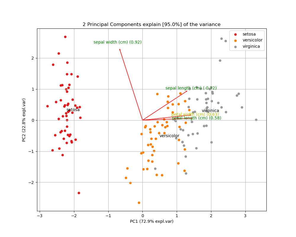
To further explore the results of PCA, we can also create biplots. A biplot is a plot that shows both the scores of each observation on the first two (or three) principal components, as well as the loadings of the features on the first two (or three) principal components.
Below I’m using the pca Python package to create a biplot of the Iris dataset. The biplot shows the first two principal components, the scores of all 150 observations, and the loadings (indicated as the vector directions) for the four feature variables. From the biplot, we can see that petal length (cm) is almost entirely loaded on the first principal component (since it’s vector is almost horizontal), while sepal width (cm) is loaded on mostly the second principal component, but also the first (indicated by its diagonal vector direction).
import pca

from sklearn.datasets import load_iris
from sklearn.preprocessing import StandardScaler

# Loading iris as NumPy arrays
X, y = load_iris(return_X_y=True)

# Scaling features
X = StandardScaler().fit_transform(X)

# Creating DataFrame of X values
X_df = pd.DataFrame(X, columns=load_iris().feature_names)

# Creating DataFrame of y values
target_names = pd.DataFrame(data=dict(target=np.unique(y),
                                      target_names=load_iris().target_names))
y_df = pd.merge(pd.DataFrame(data=dict(target=y)), target_names)

# Initializing pca.pca estimator
model = pca.pca()

# Performing PCA
results = model.fit_transform(X_df)

# Plotting biplot
fig, ax = model.biplot(y=y_df["target_names"])
Another interpretation of principal components
Earlier, I described the principal component loading vectors as the direction in feature space which the data vary the most, and the principal component scores as projections along these directions. However, it is also accurate to interpret the principal components as providing low-dimensional linear surfaces that are closest to the observations.
To expand on this, the first principal component loading vector is the line in $p$-dimensional space that is closest to the $n$ observations, where closeness is measured via average squared Euclidean distance. Thus, the first principal component satisfies the condition that it represents a single dimension of the data that lines as close as possible to all of the data points. Therefore, this line will likely provide a good summary of the data.
This concept extents beyond just the first principal component. For example, the first two principal components of a dataset span the plan that is closest to the $n$ observations. The first three principal components of a data set span a three-dimensional hyperplane that is closest to the $n$ observations, and so forth.
Scaling the variables
When performing PCA, the variables should be scaled such that they have mean zero and standard deviation one. If we did not scale the variables such that they had standard deviation one, we would find that unscaled variables with high variance would be disproportionally representing in the first few principal components. This is particularly true when some features are measured in much smaller units, and thus can take one a much larger range of values (such as dollars compared to thousands of dollars).
In addition, we would find that changing the units of our variables also changes the principal components. Because it is undesirable for our principal components to depend on an arbitrary choice of variable scaling, we typically scale each variable to have standard deviation one before we perform PCA. In situations where all the variables are measured in the same unit, we may not do this, but we should still center our variables such that their column means are zero.
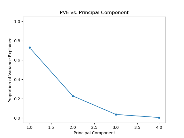
The proportion of variance explained
When performing PCA, we are often interested in knowing how much of the variance in our dataset is or is not explained in the first few principal components. More generally, we are interested in knowing the proportion of variance explained (PVE) by each principal component. Assuming the variables have been centered to have mean zero, the total variance in a dataset is defined as
\[\begin{aligned} \sum_{j=1}^{p} \text{Var}(X_j) = \sum_{j=1}^{p} \frac{1}{n} sum_{i=1}^{n} x_{ij}^2, \end{aligned}\]and the variance explained by the $m$th principal component is
\[\begin{aligned} \frac{1}{n} \sum{i=1}^{n} z_{im}^2 = \frac{1}{n} \sum_{i=1}^{n} \big (\sum_{j=1}^{p} \phi_{jm}x_{ij} \big )^2. \end{aligned}\]Thus, the PVE of $m$th principal component is a positive quantity given by
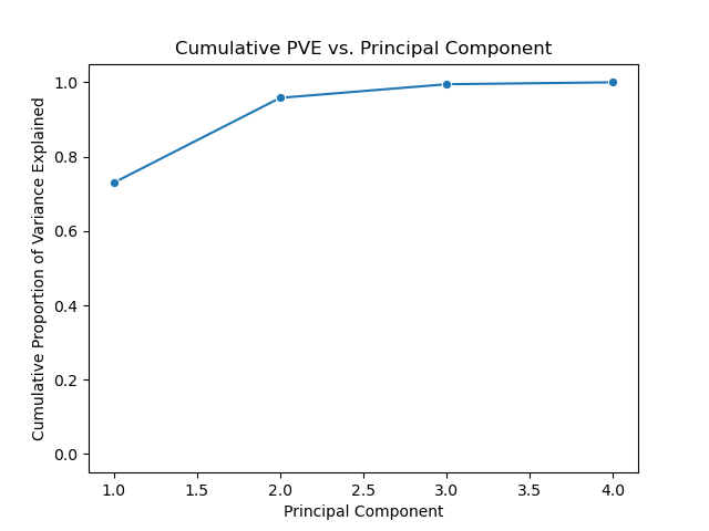
\[\begin{aligned} \frac{\sum_{i=1}^{n} \big (\sum_{j=1}^{p} \phi_{jm}x_{ij} \big )^2}{\sum_{j=1}^{p} \frac{1}{n} sum_{i=1}^{n} x_{ij}^2}. \end{aligned}\]We can of course sum each of the first $M$ PVEs to compute the cumulative PVE for the first $M$ principal components. In total, there are $\text{min}(n-1, p)$ principal components, and their PVEs sum to one.
Below is a scree plot showing the proportion of variance explained versus principal components. In contrast to the above use of the pca package, but this example I’ll use the scikit-learn API directly.
# Loading Iris
X, y = load_iris(return_X_y=True)

# Scaling features
X = StandardScaler().fit_transform(X)

# Initializing PCA estimator
# n_components=None by default, so all components will be returned
pca = PCA()

# Performing PCA
pca.fit_transform(X)  # projected X values, aka principal component scores

# Scree plot
(sns
 .lineplot(x=np.arange(1, 5),
           y=pca.explained_variance_ratio_,
           marker="o")
 .set(title="PVE vs. Principal Component",
      xlabel="Principal Component",
      ylabel="Proportion of Variance Explained",
      ylim=(-0.05, 1.05)))
We can also plot the cumulative proportion of variance explained versus principal components.
# Cumulative PVE vs. Principal Component plot
(sns
 .lineplot(x=np.arange(1, 5),
           y=np.cumsum(pca.explained_variance_ratio_),
           marker="o")
 .set(title="Cumulative PVE vs. Principal Component",
      xlabel="Principal Component",
      ylabel="Cumulative Proportion of Variance Explained",
      ylim=(-0.05, 1.05)))
Deciding how many principal components to use
In general, a $n \times p$ data matrix $\mathbf{X}$ has $\text{min}(n-1, p)$ distinct principal components. However, when performing PCA, we are typically interested in using the smallest number of principal components required to understand the data. However, this is a subjective measure, and when performing PCA in an unsupervised manner (as part of exploratory data analysis, for example), there is no single or simple answer to selecting the number of required principal components.
One method of determining the number of required principal components is by examining a scree plot plotting PVE versus principal component, such as the one above. We choose the smallest number of principal components that are required in order to explain a sizable amount of the variation in the data. To do this, we eyeball the scree plot and look for a point in which the PVE explained by each subsequent principal component drops off. This point is often referred to as an elbow of the scree plot.
Another method of determining the number of required principal components is by looking for interesting patterns in the first few principal components. If we see any, we can continue looking at more principal components until we find no more interesting patterns. If we do not find any interesting patterns in the first few principal components, it is unlikely we will in subsequent principal components.
Of course, both of the above methods are inherently subjective. However, if we are computing principal components for use in a supervised analysis, such as principal components regression, then we can perform cross-validation to determine the optimal number of principal components. In this approach, the number of principal components to include in the regression analysis can be viewed as a tuning parameter to be selected via cross-validation.
statsmodels
We can also use the statsmodels package to perform principal components analysis.
from statsmodels.multivariate.pca import PCA

# Initializing, standardize=False because X already standardized
results = PCA(X, standardize=False)

# Principal components represented vertically (vs. horizontally in scikit-learn)
results.loadings